Enhance your content presentation with a few nice extra content formatting features: numbered headings, styled lists, badges, drop-caps, and content blocks.
How to Use
The additional content formatting features are seamlessly integrated in the WordPress editor.
Do the following to apply them:
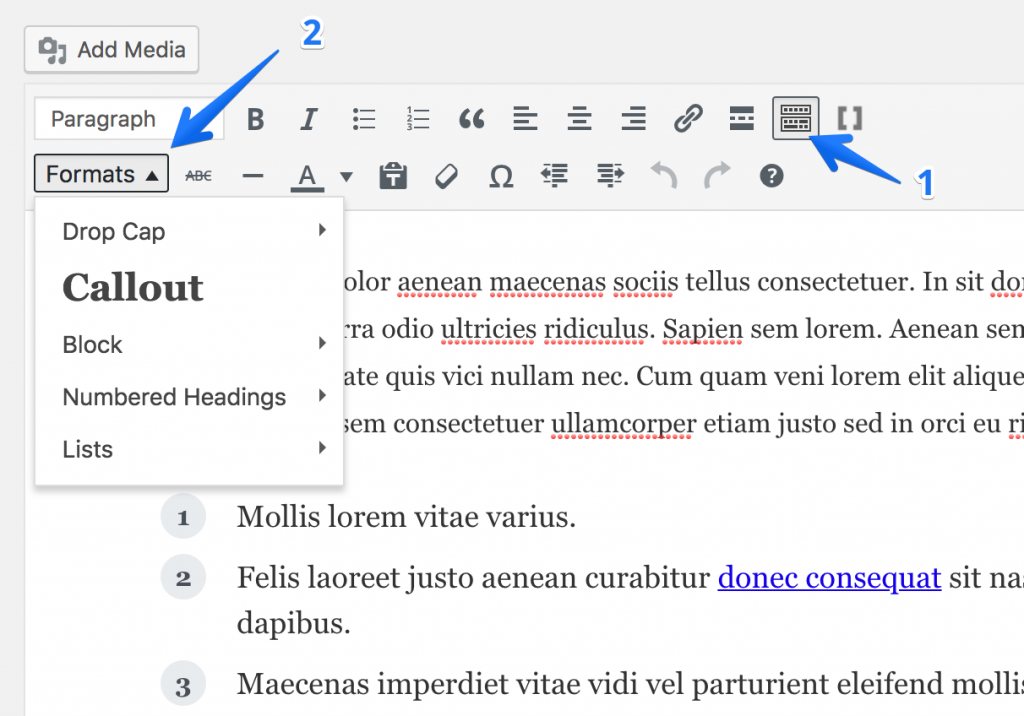
- Navigate to your post edit screen and click the Toolbar Toggle icon in the toolbar. It will expand the toolbar.
- In the second row click on the Formats button and then apply one of the content formatting options.
See this screenshot for details:

To cancel formatting, select the same option again.
Drop-Caps
In a written or published work, an initial or drop cap is a letter at the beginning of a word, a chapter, or a paragraph that is larger than the rest of the text.
There’re a few Drop-Cap styles in the dropdown menu.
Call-Outs
Call-Outs are used to highlight important and eye-catching text in your post content.
Enabling this style will make the text larger. You may also combine Call-Outs with the Block styles.
Blocks
The Block styles enable highlighting a part of your page or post content by placing it in a container with specific styles.
There’re a few options: borders, shadow, alignment or background of a block.
Numbered Headings
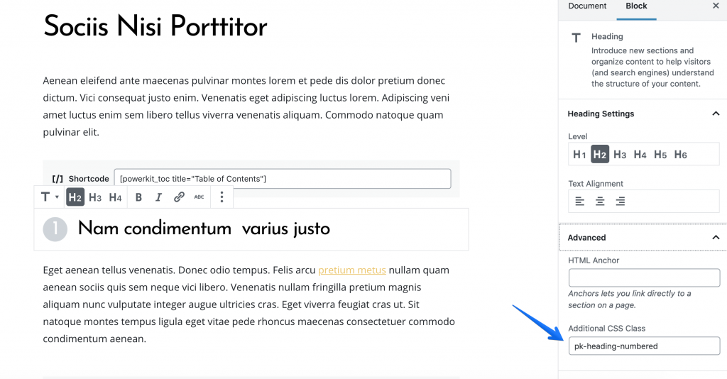
To place numbers inside your headings, simply click on the Formats button and select Numbered Headings, then select the heading level.
In the new block editor simply add the pk-heading-numbered class to the Additional CSS Class field in the Advanced tab.

Styled Lists
You may add green check marks to your lists by applying the Positive List format, red cross marks by applying the Negative List format or neutral styles by applying the Styled List format.
These format options can be applied to lists only. If you select a different element in the WordPress editor, the options will be grayed-out. Make sure you create a normal list first and only then apply the format.
Badges
Badges are small labels that can be added anywhere in the text. To add a badge, wrap your text in a span element with two classes. See the example:
<span class="pk-badge pk-badge-primary">Hot</span>There’re the following available variants: pk-badge-primary, pk-badge-secondary, pk-badge-success, pk-badge-danger, pk-badge-warning, pk-badge-info, pk-badge-dark, pk-badge-light.
WordPress 5.x.x Compatibility
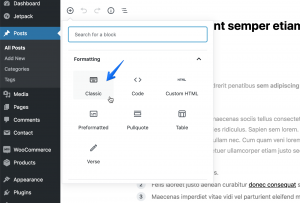
Currently this feature is supported within the Classic block only. To add this feature in the newer WordPress block editor first insert a Classic block:
